Friday, 31 January 2014

LX TYPE - the official font of Lisbon

The creative agency Leo Burnett developed a font for the city of Lisbon. Inspired by the trams' power cables that had become part of the landscape over the years, LX TYPE font presents an unique layout that can be tried in the project's website. It is also possible to download the font and use in the more popular text edition softwares.

"The trams are part of Lisbon’s landscape and become an icon of the city. In addition to painting the street yellow, they also scratch the capital’s blue sky with their wires. From the complex mesh made by them, emerged the idea of creating a typography, whose trace is formed by the wires’s random mating. Thus, the LX Type becomes Lisbon’s official type."

- Leo Burnett 


Wednesday, 29 January 2014

Projects Wanted - PINC Pavillion, by Clínica de Arquitectura

After our 2014's CALL FOR ENTRIES, we've been receiving again a very good feedback from all over the world - the Portuguese Architecture office Clínica de Arquitectura was one of the offices that accepted this invitation and sent us their "PINC Pavillion" project. This project is loacted in Porto (north of Portugal) and was concluded by the end of 2012. The photographic work was conducted by Alexandre Delmar.

We are open to receive projects from all around the world, regardless of their dimension or typology. Please send us high quality photos (indicating their authors), drawings and descriptive texts in English to our Marketing e-mail - david.cardoso@dimscale.com. It will be our pleasure to help spreading new Architecture concepts and ideas.


"PINC - Pole for the Creative Industries of Park of Science and Technology, University of Porto - quickly became a space of great dynamism of Porto. A recognized centre for the creation and production of events and contacts. It became necessary to create a meeting point, aggregating all who work there, its customers, partners and friends. A space that should be open and flexible, able to serve as pantry for the everyday meals, but also for the moments of relaxation or discussion, meeting and training, this new building should serve all sorts of events and training.

This leads to the new PINC Pavilion, built in a forgotten centennial garden, a romantic memory of the old Quinta do Mirante. The pavilion is drawn with an open and permeable structure, framed by existing trees. A structure without any coating, inspired by the images of the timeless ruins, such like these, it should merge with the garden over the time. Inside of the pavilion, by contrast, warm colours of wood based panels and the red doors fit a welcoming environment. At night, this environment expands to the garden by the hand of warm light, which overflows to the outside through glass surfaces."


- Clínica de Arquitectura


Monday, 27 January 2014

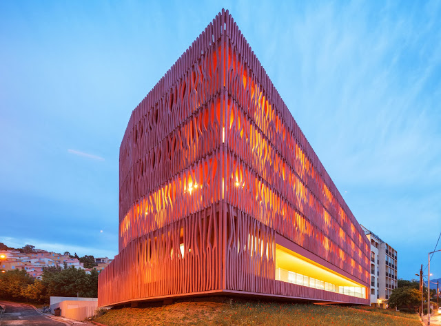
Architecture References - International Accommodation Center For The Oceanological Observatory, by Atelier Fernandez & Serres

International Accommodation Center For The Oceanological Observatory
Banyuls-sur-Mer, France
Atelier Fernandez & Serres, France

Area: 2980 sqm
Year: 2013
Photos: FG+SG

Project's description on ARCHDAILY [by the architect]:
"This project of an accommodation center consists in a restaurant, working space for scientific research and seventy-four. The building is part of a complex of facilities which include the oceanological research center and observatory of Banyuls-sur-Mer, in France. This observatory is located in the middle of the marine natural reserve of Cerbères-Banyuls, in the Pyrénées orientales department. Its purpose, as a European scientific research and training center, is to accommodate scientists and students from all over the world during short research and experimentation missions.

The building is located on the seaside and continues along the existing topography, be it of the sky, the ground or the horizon. It reinvents the relationship between the view and the landscape, and accompanies the building height plan of the city. Its ocher tones reflect the surrounding hills and the nature of the soil that comprises the cultivated terraces of the hinterlands. These hills covered with vineyards tower above the sea and glint with the deep earthy hues of iron oxides. 


The project, a rectangular monolith entirely coated in a gown of pink-ocher coral, faces the marina. It also marks the limits of the shore and the city. Behind this undulating envelope, access to the bedrooms is provided by large peripheral walkways that also serve as balconies for the accommodations. These walkways are covered with a self-consolidating concrete mesh inspired by a graphic, light and see-through coral design (Gorgones). We developed the facades using a limited amount of distinct shapes, also called strands, that were casted on site. These strands were then assembled in modules according to a simple mathematical algorithm which creates a vibration in the shadows and the matter. 

The restaurant is on the second floor. Its presence is highlighted by a large breach in the coral mesh, a window inviting the landscaping inside, and offering a panoramic view of the horizon and the open sea. The colorful concrete mesh is at the same time a balustrade and a visual filter to the sea. It provides a wall that guarantees the intimacy of users, bedrooms and walkways. It also features openings which offer a subtle variation to the framing of the near and far landscape. 

The gaze is attracted from the inside to the outside and reveals the landscape. The views become rhythmic, accentuated by the movements and the different uses. The international accommodation center of Banyuls sur Mer draws its energy from the Mediterranean Sea. Beyond simple matter, the project falls within a poetic and scientific approach in order to reveal the landscape."

- Atelier Fernandez & Serres


site plan
site plan
floor plan

floor plan
first floor plan
ground floor plan

north elevation

south elevation
east elevation