Wednesday, 29 April 2015

Projects Wanted - White Apartment, Next Level Studio

Projects Wanted is an initiative promoted by DIMSCALE Blog, in which we invite Architecture offices to share their new projects with us. We are open to receive projects from all around the world, regardless of their dimension or typology. Please send us high quality photos (indicating their authors), drawings and descriptive texts in English to our Marketing e-mail - david.cardoso@dimscale.com. It will be our pleasure to help spreading new Architecture concepts and ideas.


WHITE APARTMENT

Uherske Hradiste, Czech Republic
Next Level Studio
Total Area: 75 sqm


"Over three years lasting reconstruction of the 3+1 apartment in Uherske Hradiste, Czech Republic appealed an endless process of thoughts and construction operations, which finally filled the visions. Every line on a sketch, every statement in a computer programme, as well as every single building block, was considered as crucial everything influencing steps. The most difficult task for an architect – is designing for himself. How to recognize reserves in the design, how to set the limits behind which he doesn’t need to go though the possibilities are finally almost limitless? The design was treated as the opportunity to try out certain procedures, materials and technologies. I am interested in monochrome space, where light can be experimented. White itself has many shades, tones, and valeurs. During the day, the Sun warms the interior with light of 2000 - 3500K. While the artificial evening light set on 4200K, cools the space. Artificial light casts varied shadows, highlights different elements and the interior transmutes. Colour RGB LED strips; hidden in the niches of the furniture, enable dynamic coloration of the space. They can "paint" the space in accordance with the current wishes.

Flat, in the original condition of the 70 years, was almost completely pulled down and cleaned. The intention was to create a continuous unbroken and open space, which would increase the space both optically and physically. Door frames and thresholds were removed; vertical openings enlarged in height, parquets were over spilled with unifying polyurethane backfilling. The front door was shifted so that the input space was hit by the mass of shower bath and storage compartment. Brick wall separating the living room from the rest of the flat was replaced by a sliding wall of 2.7 m in length.

That wall primarily serves as a door to the study room; however it mostly remains parked in the kitchen. The rails under passing the transverse girders are covered with gypsum plasterboard (GPB). To create the desired plane between girders the bearing steel "C" sections were hung, and the inner space in them was used as a side light niche. By physical interconnection between the "entrance hall" and the living room the space was significantly increased, though enabling its closure if wished.

Newly created cleaned space was left in a white matt paint, including the flooring. Any new interventions embedded or free-standing furniture were left in high gloss. Besides the light an important role plays here the relationship between matte and glossy surfaces, but also a subtle contrast of structured and smooth areas, as an important means of expression.

Insertion of a classic seat suite in the narrow living room would greatly straiten the passage and was therefore made-to-measure the space, together with the coffee table. A light object levitates above the desk and focuses its white rays onto the graphics, also designed particularly for this space. If there is necessary an insertion of a larger dining table, the seat suite moves aside closer to the window. Sliding luminaire reflects that shift, so that it continues in levitation above the conference table, as its accompanying echo. Furniture TV wall integrates a sliding door to the bedroom. Location of the built-in wardrobe was selected into the weather-exposed corner of the house, where it forms a thermal impact zone. Bed conceals an ample storage space with the aid of three draw out parts on the sides. The study room is most rationally elaborated one with the emphasis on horizontal lines that optically prolong the room. The library can be divided by thirds."

- Next Level Studio 


Monday, 27 April 2015

Lighthouse SIVA - project worked with Atelier Central Arquitectos currently under construction

We are currently working on another project designed by Atelier Central Arquitectos - Lighthouse SIVA, a high-profile car dealership which will be located in Lisbon. We've been working on this project for a while, together with Atelier Central team, and recently the Portuguese Architecture office made available some images focusing the construction site.

We'll be updating this post as soon as we have more developments available. Follow also the project through DIMSCALE's website, in our Selected Projects section.

The photos' credits belong to Atelier Central Arquitectos.


Wednesday, 22 April 2015

Projects Wanted - Archivo Euskadi, ACXT

Projects Wanted is an initiative promoted by DIMSCALE Blog, in which we invite Architecture offices to share their new projects with us. We are open to receive projects from all around the world, regardless of their dimension or typology. Please send us high quality photos (indicating their authors), drawings and descriptive texts in English to our Marketing e-mail - david.cardoso@dimscale.com. It will be our pleasure to help spreading new Architecture concepts and ideas.


 ARCHIVO EUSKADI

Bilbao, Spain
ACXT
Total Area: 8.550 sqm 


"The building is located in María Díaz de Haro Street, close to the main avenue of the city of Bilbao, the Gran Via. The plot measures 20 metres between the party walls of the adjoining buildings by 70 metres deep, and forms part of one of the blocks of the Ensanche (widening of the city) of Bilbao.


Below ground, the building occupies the entire plot. Above ground, the building is 25 metres deep, following the criteria established in the planning regulations.


The program is organized by floor, depending on the degree of access control of the different uses of the building.


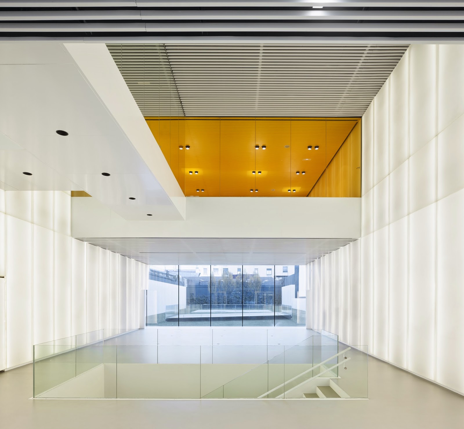
The ground floor, first floor and part of the first basement floor are for free access public uses: the main lobby, reception area, and several exhibition rooms that can also be used as a multifunction space. Through the lobby on the ground floor, the garden is accessed, a space designed to accommodate different uses such as open-air exhibitions, a reading area or area for film projections. 


On the second floor is the reading room and documentation consultation area, accessed by the public upon accreditation at reception. 


On the remaining floors above ground are the administration areas, laboratories, and documentation processing areas. These are all non-public use areas. Below ground, and also for private use, are the document vaults, meeting rooms and parking facilities. These spaces are accessed directly from the street level by a car lift.


The main façade has been designed as a vibrating glass front that increases the perception of the building, breaking with the flatness of the street and emphasizing its location. The design seeks great transparency, allowing the workings of the building and the structure to be understood from the exterior. The outer glass skin is printed with extracts of texts from some of the documents preserved within the archive, in such a way that the building is not seen as sealed place, private and closed off from the citizen.


The interior façade has been designed with a language that tries to establish a formal dialogue with the rest of the buildings of the block, while retaining the contemporary character of the building. This façade and garden seeks to project a friendly image to the users of the courtyard, dignifying a typology normally uncared for in the buildings of the Ensanche.


In the interior of the building, we have opted for double height ceilings, with visible crossing points that will enrich the relationship between the different uses existing in the building. The planned work areas are clear, free of columns and flexible in order to facilitate adaptability to possible functional changes.  


As much of the program has been developed underground, the use of natural light and ventilation has been maximized, in such a way that the lobbies to access the document vaults or garage, which is 20 metres below ground level, have natural light and ventilation. The nucleus of vertical communications and the nucleus of the lavatories of the building above ground level also have natural light.  As a result, most of the spaces and areas of circulation are bright and pleasant.    


The walls of the basement, which occupies the entire plot, have been executed using the hydrofraise technique, allowing them to be terminated before excavation commenced on the rock terrain. This decision meant that the execution times of the basement works were shortened and effect of vibration on the adjacent buildings was significantly reduced. Some of the surrounding buildings are almost 100 years old.


The primary use of the first three basement levels is that of a document archive, with capacity for 20 linear kilometres of shelving; equipped with an air conditioning system to control temperature and humidity, as well as a fire protection system using mist extinguishing.


A highly efficient air conditioning system has been designed which incorporates an enthalpy recovery and free cooling system, taking full advantage of the internal and external conditions to reduce energy consumption. In addition, in the courtyard of the block, a garden has been designed with vegetation around the air intake chiller which will help to cool the air in the hottest months of the year, allowing the system to function in a more efficient way.


The energy used for lighting is limited through the use of high-performance equipment and taking advantage of diffused light to illuminate all the areas of movement in the basements and garage, as mentioned above. Despite the depth of 20 metres, the use of light colours and light wells results in theses spaces being bright during daytime periods and not requiring artificial lighting."

- ACXT